
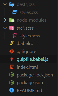
초보 개발자의 일기
SCSS 기본 본문
SCSS 사용하기
gulpfile.babel.js안에 있는 이 코드는
const routes = {
  css: {
    watch: "src/scss/*",
    src: "src/scss/styles.scss",
    dest: "dest/css",
  },
};
특정 파일을 보고 있는데 그 파일은 styles.scss이다
styles.scss이 파일이 하는 모든 행동을 다 지켜보고 있다.
styles.scss에서 일어나는 모든 일은 CSS로 compile 된다.
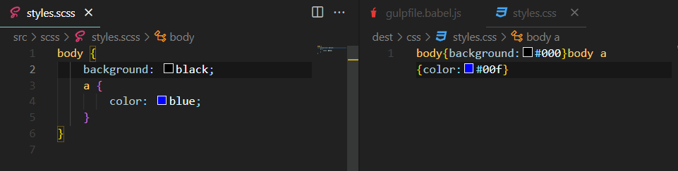
이렇게 styles.scss 파일을 수정하면 자동으로 style.css도 바뀐다.
variables
가장 중요한 color나 가장 중요한 styles을 저장하고 싶을 때 사용
_(밑줄)이 있는 파일은 CSS로 변하지 않았으면 하는 것이다.( CSS로 컴파일되기를 원하지 않음)
_variables.scss
$bg: red;$ 이름: 색깔;
styles.scss
@import "_variables";

body {
    background-color: $bg;
}
이렇게 작성을 해서 사용할 수 있다.
Nesting
타깃으로 하는 element를 더 정확하게 한다.
더 읽기 쉽게 코드를 작성할 수 있다.
styles.css
@import "_variables.scss";

h2 {
    color: $bg;
}

.box {
    margin-top: 20px;
    &:hover {
        background-color: green;
    }
    h2 {
        color: blue;
        &:hover {
            color: red;
        }
    }
    button {
        color: red;
    }
}
이렇게 코드를 작성하면
styles.css에는
h2{color:#000}.box{margin-top:20px}.box:hover{background-color:green}.box h2{color:#00f}.box button,.box h2:hover{color:red}이렇게 코드가 들어가게 된다.
mixins
scss finctionality를 재사용할 수 있도록 한다.
_mixins.scss
@mixin sexyTitle {
    color: blue;
    font-size: 30px;
    margin-bottom: 12px;
}
styles.scss
@import "_variables.scss";
@import "_mixins.scss";
h1 {
    @include sexyTitle();
}
@include를 이용해서 넣을 수 있다.
index.html
<head>
    <meta charset="UTF-8" />
    <meta name="viewport" content="width=device-width, initial-scale=1.0" />
    <link rel="stylesheet" href="dest/css/styles.css" />
    <title>(S)CSS Masterclass</title>
  </head>
  <body>
    <h1>hello</h1>
  </body>
</html>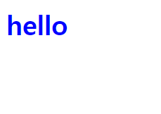
이렇게 나오게 된다.
한 개만 적용할 때는 유용해 보이지 않지만 여러 개가 있는 경우 굉장히 유용하다.
_mixins.scss
@mixin Link($word) {
  text-decoration: none;
  display: block;
  @if $word == "odd" {
    color: blue;
  } @else {
    color: red;
  }
}
이렇게 if else를 사용해서 조건을 걸 수도 있다.
styles.scss
@import "_variables.scss";
@import "_mixins.scss";
a {
    margin-bottom: 10px;
    &:nth-child(odd) {
        @include link(red);
    }
    &:nth-child(even) {
        @include link(blue);
    }
}
index.html
<head>
<meta charset="UTF-8" />
<meta name="viewport" content="width=device-width, initial-scale=1.0" />
<link rel="stylesheet" href="dest/css/styles.css" />
<title>(S)CSS Masterclass</title>
</head>
<body>
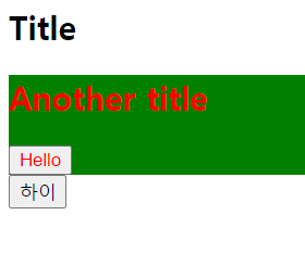
<a href="#">Google</a>
<a href="#">Google</a>
<a href="#">Google</a>
<a href="#">Google</a>
</body>
</html>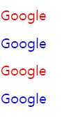
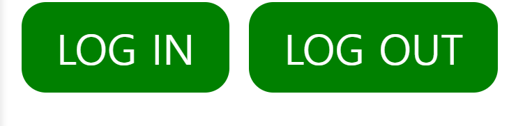
Extends
같은 코드를 중복시키고 싶지 않을 때 사용한다.
다른 코드를 extend 하거나 코드를 재사용하고 싶을 때 사용한다.
_buttons.scss
%button {
    font-family: inherit;
    border-radius: 7px;
    font-size: 12px;
    text-transform: uppercase;
    padding: 5px 10px;
    background-color: green;
    font-weight: 500;
    color: white;
}
공통적인 것을 이쪽에 넣고
styles.scss
@import "_buttons";
a {
    @extend %button;
    text-decoration: none;
}

button {
    @extend %button;
    border: none;
}
서로 다르게 할 것을 이렇게 넣으면 된다.
_mixins.scss
$minIphone: 500px;
$maxIphone: 690px;
$minTablet: $minIphone + 1;
$maxTablet: 1120px;

@mixin responsive($device) {
    @if $device == "iphone" {
        @media screen and (min-width: $minIphone) and (max-width: $maxIphone) {
            @content;
        }
    } @else if $device == "tablet" {
        @media screen and (min-width: $minTablet) and (max-width: $maxTablet) {
            @content;
        }
    } @else if $device == "iphone-l" {
        @media screen and (max-width: $minIphone) and (max-width: $maxIphone) and (orientation: landscape) {
            @content;
        }
    } @else if $device == "ipad-l" {
        @media screen and (min-width: $minTablet) and (max-width: $maxTablet) and (orientation: landscape) {
            @content;
        }
    }
}
styles.scss
@import "_mixins";
h1 {
    color: red;
    @include responsive("iphone") {
        color: yellow;
    }
    @include responsive("iphone-l") {
        font-size: 60px;
    }
    @include responsive("tablet") {
        color: green;
    }
}
핸드폰이 어떤 것일때 색깔을 다르게 할 수 있다.
위에서 설정한 크기별로 글자색이 달라지는 것을 볼 수 있다.
'Frontend practice > CSS' 카테고리의 다른 글
| type='radio' button 처럼 사용하기 (1) | 2023.04.24 |
|---|---|
| CSS flex box (1) | 2022.05.08 |
| CSS inline, block (1) | 2022.05.07 |
| CSS 복합 셀렉터 (0) | 2022.05.06 |
| CSS 박스 모델 2 (0) | 2022.05.06 |


