초보 개발자의 일기
Media Queries 본문
728x90
Media Queries
- Media query는 오직 CSS만을 이용해서 스크린의 사이즈를 알 수 있는 방법이다.(웹사이트를 보고 있는 사용자의 스크린 사이즈)
- @media screen and (max-width: 00px) {}을 이용하여 몇 픽셀부터는 달라 보이도록 만들 수 있다. 이를 통해 스크린의 사이즈를 알 수 있다.
- min 사이즈와 max사이즈를 조절하여 단계별로 만들면, 스크린 사이즈의 범위를 알 수 있다.
- 브라우저에서 inspect의 device toolbar를 이용하여 핸드폰 기종 별 사이즈로 브라우저를 볼 수 있다.
- media screen에 (orientation: landscape)를 이용하면, 세로모드인지 가로모드 인지도 구별할 수 있다.
        <style>
            body {
                display: flex;
                height: 100vh;
                align-items: center;
                justify-content: center;
            }
            div {
                background-color: teal;
                width: 200px;
                height: 200px;
            }
            @media screen and (max-width: 1000px) {
                div {
                    background-color: tomato;
                }
            }
            @media screen and (min-width: 1001px) and (max-width: 1200px) {
                div {
                    background-color: wheat;
                }
            }
            @media screen and (min-width: 1200px) {
                div {
                    background-color: turquoise;
                }
            }
        </style>
    </head>
    <body>
        <div></div>
    </body>
1200px보다 클때 turquoise 색

1001px에서 1200px보다 작을 때 wheat 색
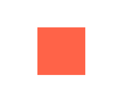
1000px 보다 작을때 tomato 색
728x90
'노마드 코더 > 코코아 클론' 카테고리의 다른 글
| 빨간 점 만들기 (1) | 2022.07.18 |
|---|---|
| border-box (0) | 2022.07.15 |
| Advanced CSS (0) | 2022.07.12 |
| CSS (0) | 2022.07.10 |
'노마드 코더/코코아 클론' Related Articles
more


